Case Study: Hadorn's
December 13, 2014
 — Bardstown Tourism, visitbardstown.com
Hadorn's Bakery
There's an old saying (that I just made up) about Hadorn's Bakery: You come to Bardstown, KY for the bourbon, but you stay for Hadorn's.
Hadorn's Bakery is one of the greatest gems of Bardstown. I've lived here since the age of 5, and no other store has the presence of Hadorn's. If you ask any local for their favorite local bakery, nearly 100% of them will state Hadorn's—It's simply the best choice.
Bardstown prides itself in maintaining and conserving its rich history. Because of this, the city remains beautiful and full of discovery, earning the title of "Most Beautiful Small Town in America" by USA Today. There is a negative byproduct of this thought process, though—these amazing small businesses have extremely weak or no online persona. They've all relied on good 'ol word-of-mouth marketing to maintain their income, not seeing the ever-growing internet as a rich source of presenting themselves.
Haydorn's needed to keep up with the changing times, so I envisioned a new look for them.
The Logo
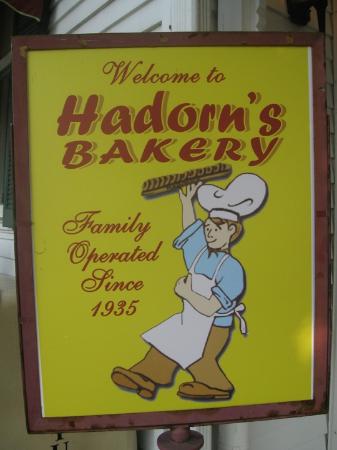
Hadorn's doesn't have a logo. Unless you count this as a logo:
They needed some sort of mark for them, so I had to help with that identity. My design process for logos varies from project to project. For this one, I started straight in Photoshop to get the basic concept down. I had no idea what colors, shapes, or typefaces to use.
First Iteration
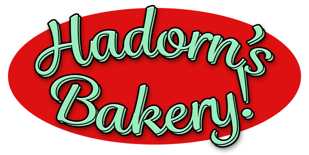
This was the first logo I came up with. Note the amazing Christmas-like color scheme and incredibly bland imagery. A lot of this logo, believe or not, remained in the final product. Hopefully you can see why I wanted to move on from this, but it was a solid start.
Second Iteration
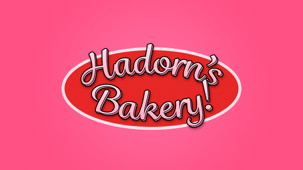
Here is where first started to explorer better color schemes. Hadorn's is known for its donuts, so I tried to mess around with a pink/red color palette to mimic those of donut sprinkle fame. I also added a pattern to the backgroud to hopefully give it some life which was absolutely missing in the initial concept.
Third Iteration
Here is where I made huge strides. I removed the horizontal symmetry by adding some weight to the bottom alongside the top's. I also made the risky move of de-emphasizing the word bakery. My reasoning was that everyone who knew of Hadorn's knew it was a bakery. It also left room for if they wanted to expand upon their bakery business. Also, everyone called the place Hadorn's, not Hadorn's Bakery. It felt redundant, in my opinion, so it was axed for the better. The main typeface, shape, and background pattern remained from the two previous versions, you'll notice. It also is a lot more "food"-like and less like a logo for a toy-making company, unlike the two other iterations.
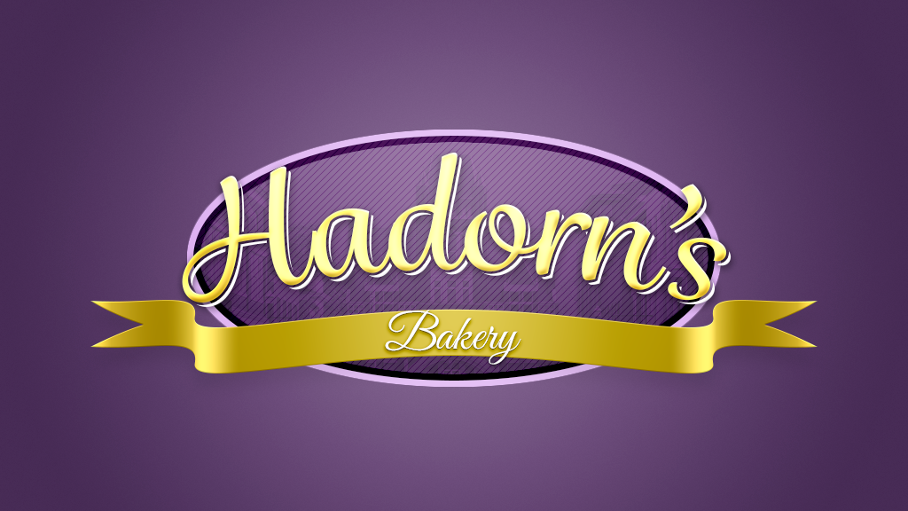
The color palette was also changed. Bardstown City's school district's colors a purple and gold. Louisville's new soccer team's colors are purple and gold. The color of royalty is purple and gold. It just felt right. This was a very tough decision to make because my high school rivaled Bardstown City Schools. But, for the sake of tradition, continuity, and consistency, I stuck with it.
Inside the oval I included a very faint image of Bardstown's most memorable view—the old courthouse (we moved to a new courthouse a few years ago, this is now the visitor's center, but it is known as the old courthouse for obvious reasons). I doubt you can actually see the background I made, but it's there, believe me!
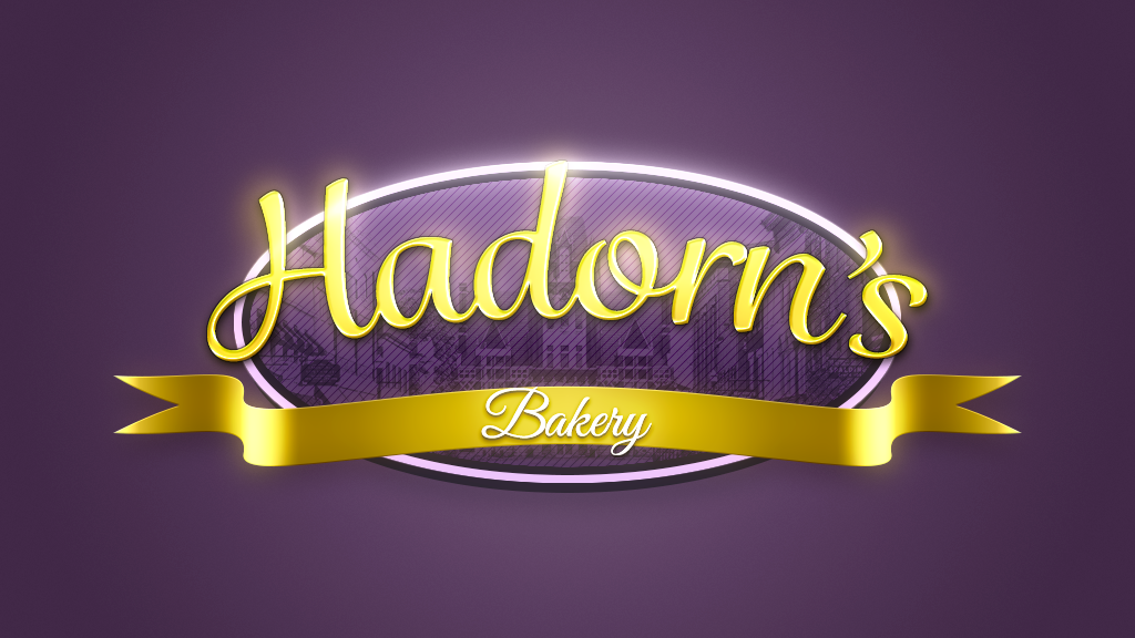
Final Iteration
See, there it is! This is the final logo I came up with. Other than bumping up the contrast on the image of Bardstown, the previous iteration in general was just too flat for me. It wasn't "rich" enough and it didn't feel too inviting. It like a Willy Wonka knock-off and not an individual logo. There was also an extreme lack of contrast between all of the elements, and I wanted to make them feel "alive" in a sense, but still part of the actual logo.
The main logotype now looks made of gold instead of silly putty with some sort of strange faux-3d offset dropshadow... thing. It's a very rich and smooth style, which I like a lot. The ribbon is also a ton shinier, with an increased contrast on the word "Bakery" against the ribbon.
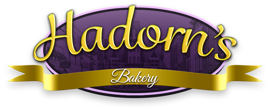
Here is a version that was pretty'd up for presenting with some lighting cues from Daft Punk.